Want more ideas and freebies?
Get my free resource library with digital & print activities—plus tips over email.
Join for Free Resources →
$4.25
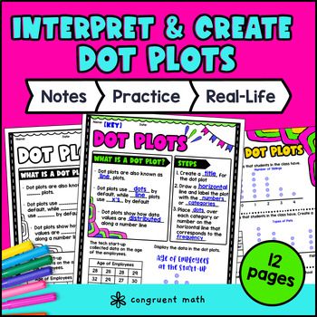
Ever wondered how to teach dot plots in an engaging way to your 6th grade students? In this lesson plan, students will learn how to construct and interpret dot plots and their real-life applications. Through artistic, interactive guided notes, check for understanding, a maze worksheet, and a doodle & color by number activity, students will gain a comprehensive understanding of dot plots.
The lesson culminates with a real-life example that explores how coaches can use dot plots to monitor the performance of their athletes in a variety of ways, such as identify star performers or tracking progress over time.

$4.25
After this lesson, students will be able to:
Before this lesson, students should be familiar with:
As a hook, ask students why coaches might use dot plots to track the performance of their athletes. Refer to the last page of the guided notes as well as the FAQs below for ideas.
Use the guided notes to introduce the concept of dot plots. Walk through the key examples of of constructing and interpreting dot plots in page 2 and 3 of the guided notes. Refer to the FAQ below for a walk through on this, as well as ideas on how to respond to common student questions.
Have students work on the rest of the problems pertaining to the practice sheets (pg. 2 and 3). You can put the students together in small groups or pairs so they can learn from each other. Then, call on students to talk through their answers, potentially on the whiteboard or projector. Based on student responses, reteach concepts that students need extra help with.
Have students practice constructing and interpreting dot plots using the Maze worksheet from the lesson plan. Walk around to answer student questions.
Fast finishers can dive into the Doodle & Color by Number activity for extra practice. You can assign it as homework for the remainder of the class.
Bring the class back together, and introduce the concept of sports statistics as a real-world application of dot plots. Coaches can use dot plots to monitor the performance of their athletes in a variety of ways, such as identifying star performers or tracking progress over time.
Refer to the FAQ section of the lesson plan for more ideas on how to teach it!
If you're looking for digital practice for dot plots, try the Pixel Art activities in Google Sheets. Every answer is automatically checked, and correct answers unlock parts of a mystery picture. It’s incredibly fun, and a powerful tool for differentiation.
Here's one activity to explore: Dot Plots, Histograms, and Stem-and-Leaf Plots 3 Pixel Art
"A fun, no-prep way to practice dot plots is Doodle & Color by Number — they're a fresh take on color by number or color by code. It includes multiple levels of practice, perfect for a review day or sub plan.
Here's one activity to explore: Dot Plots, Histograms, Stem-and-Leaf Plots Doodle Math Color by Number
A dot plot is a type of graph that shows the frequency of data points in a dataset. The dots represent individual data points, and the number of dots in each column represents the frequency of data points in that range.
To construct a dot plot, first determine the range of the data and the size of each bin. Then, create a number line and label it with the appropriate intervals. Finally, place a dot above each interval to represent the frequency of data points in that range.
A histogram is a type of graph that shows the distribution of continuous data. It uses bars to represent the frequency of data points in each interval. A dot plot, on the other hand, is used to represent the frequency of individual data points.
Dot plots can be used in a variety of real-life applications. For example, coaches can use dot plots to monitor the performance of their athletes over time. They can also be used to track customer satisfaction ratings or to analyze the results of a survey.
Some key vocabulary terms related to dot plots include frequency, interval, bin, and range.
Dot plots and line plots are similar in that they both show the frequency of data points in a dataset. However, dot plots represent each data point with a dot, while line plots connect adjacent data points with a line. Line plots are often used when the data set is smaller and has fewer distinct values.
Get my free resource library with digital & print activities—plus tips over email.
Join for Free Resources →