Want more ideas and freebies?
Get my free resource library with digital & print activities—plus tips over email.
Join for Free Resources →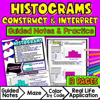
$4.25
Ever wondered how to teach histograms in an engaging way to your sixth-grade students?
In this lesson plan, students will learn about histograms and their real-life applications. Through artistic, interactive guided notes, check for understanding, practice (a doodle & color by number activity, and a maze worksheet), students will gain a comprehensive understanding of creating and analyzing histograms.
The lesson culminates with a real-life example that explores how statistical questions can be used in real life. Students will see how histograms can be used to summarize and interpret numerical data sets in relation to their context.
$4.25
After this lesson, students will be able to:
Before this lesson, students should be familiar with:
As a hook, ask students why it is important to display numerical data in plots. This will engage students and activate their prior knowledge on the topic. Refer to the last page of the guided notes as well as the FAQs below for ideas.
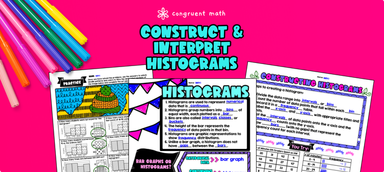
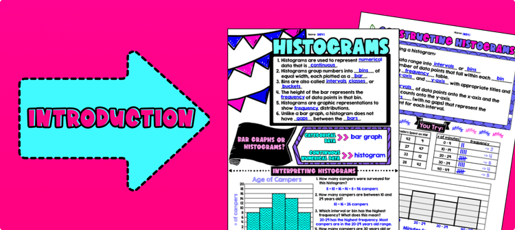
Use the first page of the guided notes to introduce the concept of histograms. Explain to students what a histogram is and its purpose in displaying numerical data. Review the difference between categorical and numerical data, as well as when to use bar graphs and when to use histograms.
Use the second page of the guided notes to introduce the key points of constructing a histogram, including determining intervals or bins for the data and counting the frequency of each interval. Refer to the FAQ below for a walk through on this, as well as ideas on how to respond to common student questions.
If your class has a wide range of proficiency levels, you can pull out students for reteaching, and have more advanced students begin work on the practice exercises.
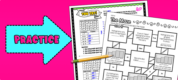
Have students practice creating and analyzing histograms using the practice page provided on pages 3 - 5 of the resource. Walk around the classroom to answer any questions that students may have.
Fast finishers of the "you try" practice sheet can then move on to the maze activity or doolde math activity for extra practice. Alternatively, you can also assign the maze activity or doodle math as homework for students who have not completed it during class time.
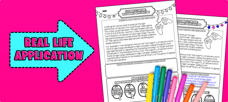
Bring the class back together, and introduce the concept of using histograms to analyze data in real-life situations. Explain that histograms are commonly used in various fields to understand and analyze numerical data.Use the last page of the guided notes resource to teach the real-life application of histograms.
In addition, you can start a discussion to help students connect the concept of histograms to areas such as:
By discussing these real-life applications, students will gain a deeper understanding of how histograms can be used as a powerful tool for data analysis and decision-making in various fields. Encourage students to think of other areas where histograms may be used and to share their ideas with the class.
If you're looking for digital practice for histograms, try my Pixel Art activities in Google Sheets. Every answer is automatically checked, and correct answers unlock parts of a mystery picture. It's incredibly fun, and a powerful tool for differentiation.
Here are some activities to explore:
A fun, no-prep way to practice histograms is Doodle Math — they're a fresh take on color by number or color by code. It includes multiple levels of practice, perfect for a review day or sub plan.
Here are some activities to try:
A histogram is a graphical representation of numerical data where the data is grouped into intervals or bins, and the height of each bar represents the frequency or count of data points within that interval.
To construct a histogram, you need to:
Numerical data refers to any data that can be measured or expressed in numbers. It includes quantities such as height, weight, temperature, and scores on a test.
Continuous data is a type of numerical data that can take on any value within a certain range. It can include decimals and fractions, and there are no gaps or interruptions in the data. Examples include the temperature at different times of the day or the heights of students in a class.
Intervals or bins in a histogram are the ranges in which the data is grouped. They are represented on the x-axis of the histogram and help organize the data into meaningful groups.
To analyze and interpret data from histograms, you can:
Histograms summarize numerical data sets by providing a visual representation of the distribution of the data. They show the frequencies or counts of data points within different intervals or bins, allowing you to see the overall pattern, shape, and characteristics of the data.
Sure! One example of how histograms can be used is in analyzing the heights of students in a classroom. By creating a histogram of the heights, you can see the distribution of heights, identify any patterns or outliers, and make comparisons between different groups within the data (e.g., boys vs. girls). This information can be helpful for understanding the average height, the range of heights, and any other characteristics of the students' heights.
Get my free resource library with digital & print activities—plus tips over email.
Join for Free Resources →