Want more ideas and freebies?
Get my free resource library with digital & print activities—plus tips over email.
Join for Free Resources →
$4.25
Ever wondered how to teach scatter plots and associations in an engaging way to your 8th-grade students?
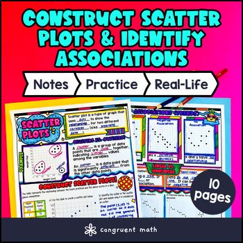
In this lesson plan, students will learn about constructing scatter plots to represent bivariate data and identify positive association, negative association, or no association in the data. They will also learn about clusters, outliers, linear associations, and nonlinear associations. Through artistic, interactive guided notes, check for understanding, a color by code activity, and a maze worksheet, students will gain a comprehensive understanding of constructing scatter plots and identifying associations.
The lesson concludes with a real-life example that explores how scatter plots can be used to analyze trends in various fields, such as sports statistics or health data.

$4.25
After this lesson, students will be able to:
Before this lesson, students should be familiar with:
As a hook, ask students why understanding scatter plots and associations might be important in making decisions about trends, such as predicting weather patterns or analyzing sports performance. Encourage them to think about scenarios where visualizing data could simplify complex information. Refer to the last page of the guided notes for specific examples related to real-life applications, as well as the FAQs below for additional ideas.
Use the first page of the guided notes to introduce the concept of scatter plots. Define bivariate data and explain how scatter plots visually represent the relationship between two variables. Use the top section to explain the concept of clusters and outliers.
Then, use the second page of the guided notes to introduce the idea of identifying associations in scatter plots. Explain positive association, negative associations, and now associations using the 3 fill-in-the blank examples. Ask students to share what they noticed about the 3 types of graphs and encourage students to draw their own observations. Then, use the middle section of the guided notes to explain the difference between linear vs. nonlinear associations. Encourage discussion among students about how associations can be misleading without context. Refer to the FAQ below for guidance on how to address student inquiries about interpreting slopes and the implications of different associations.
If your class has a wide range of proficiency levels, be prepared to provide additional support to students who may struggle with these concepts. Pull out those students for more focused, hands-on reteaching as needed, while having more advanced students begin working on understanding outliers and clusters within the context of their practice exercises.
Have students practice constructing scatter plots and identifying associations using the maze activity (page 3 of the guided notes resource). Walk around to answer student questions.
Fast finishers can work on the color by number activity (page 4 of the guided notes resource) for extra practice. You can also assign it as homework for the remainder of the class.
Using the last page of the guided notes resource, bring the class back together and introduce the concept of how scatter plots can be used in real-world situations, such as analyzing the relationship between study habits and test scores, or examining trends in weather data over time. These visual representations help us identify patterns, associations, and outliers that can inform decisions. For example, by plotting the number of hours students study against their scores on a math test, we can visually assess whether there is a positive or negative correlation.
This application shows students that statistics are not just numbers, but tools that can provide valuable insights in everyday life. Refer to the FAQ for more ideas on how to teach it!
If you’re looking for digital practice for constructing scatter plots and identifying associations, try my Pixel Art activities in Google Sheets. Every answer is automatically checked, and correct answers unlock parts of a mystery picture. It’s incredibly fun, and a powerful tool for differentiation.
Here’s 1 activity to explore:
A scatter plot is a type of graph that showcases the relationship between two quantitative variables. Each point on the graph represents an observation from the dataset.
To construct a scatter plot, follow these steps:
A positive association indicates that as one variable increases, the other variable also tends to increase. The points in a scatter plot with a positive association will generally slope upwards from left to right.
A negative association suggests that as one variable increases, the other variable tends to decrease. In a scatter plot, points with a negative association typically slope downwards from left to right.
In a scatter plot, "no association" means there's no clear relationship between the two variables. The points are scattered randomly, showing no upward or downward trend, indicating the variables are independent of each other.
Outliers are data points that are significantly different from the others in the dataset. They can be much higher or lower than the rest of the points, possibly indicating special cases or errors in data collection.
Clusters are groups of points that are close together on the scatter plot. To identify clusters, look for areas where there are a high density of points, which may indicate a common relationship among those data points.
A linear association suggests a straight-line relationship between two variables, while nonlinear associations may demonstrate relationships that curve or change direction. To assess this, you can visually inspect the direction and form of the plotted points.
Scatter plots are useful in various fields such as:
Get my free resource library with digital & print activities—plus tips over email.
Join for Free Resources →