Want more ideas and freebies?
Get my free resource library with digital & print activities—plus tips over email.
Join for Free Resources →
$4.25
Ever wondered how to teach the line of best fit in a scatter plot through an engaging way to your 8th grade students?
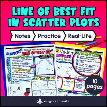
In this lesson plan, students will learn about analyzing scatter plots, identifying line of best fit, and writing the equation of the line of best fit in slope intercept form. Through artistic, interactive guided notes, check for understanding, a color by code activity, and a maze worksheet, students will gain a comprehensive understanding of the line of best fit.
The lesson concludes with a real-life example that explores how businesses use line of best fit to make predictions based on data trends.

$4.25
After this lesson, students will be able to:
Before this lesson, students should be familiar with:
As a hook, ask students why making predictions based on data might be important in real life. For example, how might a business use data to decide on the best way to market a product? How might this be applied in the field of sports? This start will engage students and highlight the relevance of the lesson.
Use page 1 of the guided notes to introduce the concept of the line of best fit. Explain that the line of best fit is a tool used to find a linear relationship in bivariate data, which is essentially data that involves two different variables. Highlight the significance of this line in making predictions about one variable based on the known values of another. Discuss key concepts like scatter plots and how to determine the line of best fit. Emphasize that the line of best fit should be positioned so that there are roughly equal numbers of data points above and below it, which helps ensure it is accurately representing the trend in the data.
Use page 2 of the guided notes to discuss how to calculate the equation for the line of best fit. Walk through the concept of slope and intercept. Walk through one example on the page, using the 4 steps, with the students and then have them work through the examples on the bottom of the page. Examples on the page will also walk through how to make predictions using the line of best fit. Encourage students to think critically about what the predictions mean in real-world contexts and what assumptions they should be cautious about.
If your class has a wide range of proficiency levels based on student responses, identify and determine which concepts may need further reteaching. If certain students struggle with understanding the line of best fit, consider pulling them aside for focused instruction while more advanced students can begin working on initial practice exercises independently.
Have students practice the line of best fit using page 3 of the guided notes resource. It contains problem sets on drawing the line of best fit, making predictions, and writing equations for the line of best fit. Walk around to answer student questions.
Fast finishers can start working the maze activity (page 4 of the guided notes) for extra practice. You can assign it as homework for the remainder of the class.
Using the last page of the guided notes resource, bring the class back together and introduce the concept of using lines of best fit in real-world scenarios, such as predicting future trends based on existing data.
Explain how businesses might use this statistical method to forecast sales based on past performance, or how scientists can predict outcomes in experiments. Show examples such as predicting a child's future height based on past growth data or how social scientists analyze data trends in populations. Highlighting these applications helps students see the relevance of math in everyday life and encourages them to think critically about the data they encounter. Refer to the FAQ for more ideas on how to teach it!
If you’re looking for digital practice for the line of best fit in scatter plots, try my Pixel Art activities in Google Sheets. Every answer is automatically checked, and correct answers unlock parts of a mystery picture. It’s incredibly fun, and a powerful tool for differentiation.
Here’s 1 activity to explore:
The line of best fit is a straight line that best represents the data points on a scatter plot. It helps show the trend or relationship between two sets of data.
To make predictions, find the equation of the line of best fit and plug in the x-value for which you want to predict the y-value.
The formula for the line of best fit is typically represented as ( y = mx + b ), where ( m ) is the slope and ( b ) is the y-intercept.
To find the slope (m), use the formula ( m = (y2-y1) / (x2-x1)) , which calculates the change in y divided by the change in x between two points on the line.
The y-intercept (b) indicates the value of y when x equals zero. It provides insight into the starting point of the relationship being analyzed.
Using a line of best fit helps summarize the relationship between variables, allows for making predictions, and can highlight trends or correlations in data.
A good line of best fit will be close to the majority of the data points, showing minimal distance from these points. The line of best fit should be positioned so that there are roughly equal numbers of data points above and below it, which helps ensure it is accurately representing the trend in the data.
Correlation refers to a statistical relationship between two variables, while causation implies that one variable directly affects another. A line of best fit shows correlation but does not confirm causation.
Get my free resource library with digital & print activities—plus tips over email.
Join for Free Resources →